
Ver3.0 🎨 유연한 레이아웃 구현: CSS 그리드와 플렉스박스 활용법
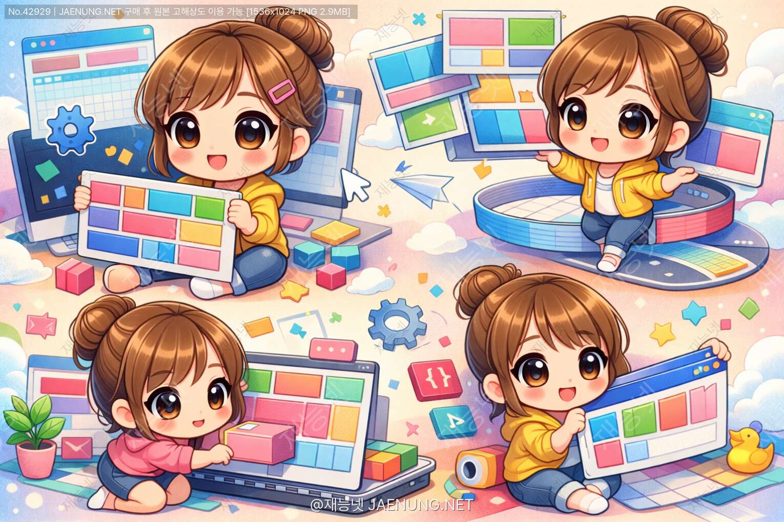
🎨 유연한 레이아웃 구현: CSS 그리드와 플렉스박스 활용법
웹 개발자라면 반드시 알아야 할 레이아웃의 모든 것! 🚀
🌟 왜 지금 CSS 그리드와 플렉스박스를 배워야 할까?
안녕! 오늘은 웹 개발에서 정말 중요한 주제를 다뤄볼 거야. 바로 CSS 그리드(Grid)와 플렉스박스(Flexbox)! 😊
솔직히 말해서, 예전에는 웹 레이아웃 만드는 게 정말 골치 아팠어. float로 이것저것 띄우고, clear로 정리하고... 생각만 해도 머리가 아프지? 😅
하지만 이제는 달라! CSS 그리드와 플렉스박스 덕분에 레이아웃 작업이 정말 쉬워졌어. 마치 레고 블록 조립하듯이 직관적으로 배치할 수 있게 됐거든.
특히 요즘처럼 모바일, 태블릿, 데스크톱 등 다양한 화면 크기에 대응해야 하는 시대에는 이 두 기술이 필수야. 반응형 웹 디자인을 구현하는 데 이만한 도구가 없거든! 💪
🎯 플렉스박스(Flexbox) 완전 정복
자, 이제 본격적으로 플렉스박스부터 파헤쳐볼까? 플렉스박스는 2009년에 처음 제안됐고, 지금은 모든 주요 브라우저에서 완벽하게 지원하고 있어. 🌐
플렉스박스의 핵심 개념은 "유연한 박스"야. 컨테이너 안의 아이템들이 공간에 따라 자동으로 크기를 조절하고 배치되는 거지. 마치 물처럼 흐르듯이 말이야! 💧
📦 플렉스박스의 기본 구조
플렉스박스를 사용하려면 먼저 두 가지 개념을 이해해야 해:
1. 플렉스 컨테이너(Flex Container) - 부모 요소
2. 플렉스 아이템(Flex Items) - 자식 요소들
컨테이너에 display: flex를 선언하는 순간, 그 안의 자식 요소들은 자동으로 플렉스 아이템이 돼. 정말 간단하지? 😊
/* 부모 요소에 적용 */
.container {
  display: flex;
}

/* 이제 자식 요소들이 가로로 나란히 배치됨! */
🎨 주요 방향(Main Axis)과 교차 축(Cross Axis)
플렉스박스를 제대로 이해하려면 축(axis) 개념이 중요해. 두 개의 축이 있거든:
주요 축(Main Axis) - 아이템들이 배치되는 주된 방향
교차 축(Cross Axis) - 주요 축에 수직인 방향
기본적으로 주요 축은 가로(→)야. 하지만 flex-direction으로 방향을 바꿀 수 있어!
• row (기본값) - 왼쪽에서 오른쪽으로 →
• row-reverse - 오른쪽에서 왼쪽으로 ←
• column - 위에서 아래로 ↓
• column-reverse - 아래에서 위로 ↑
.container {
  display: flex;
  flex-direction: row; /* 가로 배치 */
}

.container-vertical {
  display: flex;
  flex-direction: column; /* 세로 배치 */
}
🎯 justify-content: 주요 축 정렬
justify-content는 주요 축을 따라 아이템들을 어떻게 배치할지 결정해. 이게 진짜 강력한 기능이야! ⚡
(기본값)
(끝으로)
(가운데)
(양끝 정렬)
(균등 분배)
(완전 균등)
/* 아이템들을 가운데 정렬 */
.container {
  display: flex;
  justify-content: center;
}

/* 아이템들 사이에 균등한 간격 */
.container-spaced {
  display: flex;
  justify-content: space-between;
}

/* 네비게이션 메뉴 만들기 */
.nav {
  display: flex;
  justify-content: space-around;
  padding: 20px;
  background: #667eea;
}

.nav-item {
  color: white;
  padding: 10px 20px;
}
⬆️ align-items: 교차 축 정렬
align-items는 교차 축을 따라 아이템들을 정렬해. 주요 축이 가로라면, 교차 축은 세로가 되는 거지! 📏
• stretch (기본값) - 컨테이너 높이만큼 늘어남
• flex-start - 교차 축의 시작점 정렬
• flex-end - 교차 축의 끝점 정렬
• center - 교차 축의 중앙 정렬
• baseline - 텍스트 베이스라인 정렬
/* 세로 중앙 정렬 (가장 많이 쓰는 패턴!) */
.container {
  display: flex;
  justify-content: center; /* 가로 중앙 */
  align-items: center; /* 세로 중앙 */
  height: 100vh; /* 화면 전체 높이 */
}

/* 이제 완벽한 중앙 정렬! */🔄 flex-wrap: 줄바꿈 처리
기본적으로 플렉스 아이템들은 한 줄에 다 들어가려고 해. 공간이 부족하면 아이템들이 찌그러지는 거지. 😅
하지만 flex-wrap을 사용하면 아이템들이 자동으로 다음 줄로 넘어가!
• nowrap (기본값) - 한 줄에 모두 배치
• wrap - 여러 줄로 나눔
• wrap-reverse - 여러 줄로 나누되 역순
/* 반응형 카드 레이아웃 */
.card-container {
  display: flex;
  flex-wrap: wrap;
  gap: 20px; /* 아이템 간 간격 */
}

.card {
  flex: 1 1 300px; /* 최소 300px, 유연하게 늘어남 */
  padding: 20px;
  background: #f5f5f5;
  border-radius: 10px;
}
💪 flex 속성: 아이템의 크기 조절
이제 개별 아이템에 적용하는 속성을 볼 차례야. flex는 세 가지 속성의 단축 표현이야:
flex-grow - 늘어나는 비율
flex-shrink - 줄어드는 비율
flex-basis - 기본 크기
보통은 flex: 1 이런 식으로 간단하게 써!
/* 모든 아이템이 동일한 크기로 */
.item {
  flex: 1;
}

/* 특정 아이템만 2배 크기로 */
.item-large {
  flex: 2;
}

/* 3개 아이템이 1:2:1 비율로 */
.item-1 { flex: 1; }
.item-2 { flex: 2; }
.item-3 { flex: 1; }

/* 고정 크기 + 유연한 크기 조합 */
.sidebar {
  flex: 0 0 250px; /* 250px 고정 */
}

.main-content {
  flex: 1; /* 나머지 공간 모두 차지 */
}
🎪 실전 예제: 네비게이션 바 만들기
자, 이제 배운 걸 활용해서 실제로 많이 쓰는 네비게이션 바를 만들어볼까? 🎨
<nav class="navbar">
  <div class="logo">MyWebsite</div>
  <div class="nav-links">
    <a href="#">Home</a>
    <a href="#">About</a>
    <a href="#">Services</a>
    <a href="#">Contact</a>
  </div>
  <div class="nav-button">
    <button>Login</button>
  </div>
</nav>

/* CSS */
.navbar {
  display: flex;
  justify-content: space-between;
  align-items: center;
  padding: 20px 40px;
  background: #667eea;
  color: white;
}

.logo {
  font-size: 24px;
  font-weight: bold;
}

.nav-links {
  display: flex;
  gap: 30px;
}

.nav-links a {
  color: white;
  text-decoration: none;
  transition: opacity 0.3s;
}

.nav-links a:hover {
  opacity: 0.7;
}

.nav-button button {
  padding: 10px 25px;
  background: white;
  color: #667eea;
  border: none;
  border-radius: 5px;
  cursor: pointer;
  font-weight: bold;
}

/* 모바일 대응 */
@media (max-width: 768px) {
  .navbar {
    flex-direction: column;
    gap: 20px;
  }

  .nav-links {
    flex-direction: column;
    text-align: center;
    gap: 15px;
  }
}• 반응형 디자인이 쉽게 구현됨
• 아이템 간 간격 조절이 자유로움
• 유지보수가 편함
• 브라우저 호환성 완벽
🎨 CSS 그리드(Grid) 마스터하기
자, 이제 CSS 그리드로 넘어가볼까! 그리드는 플렉스박스보다 조금 늦게 나왔지만, 더 강력한 기능을 가지고 있어. 🚀
플렉스박스가 1차원(행 또는 열)이라면, 그리드는 2차원(행과 열을 동시에) 다룰 수 있어. 마치 엑셀 스프레드시트처럼 말이야! 📊
복잡한 레이아웃을 만들 때는 그리드가 훨씬 편해. 특히 갤러리, 대시보드, 매거진 스타일 레이아웃에는 그리드가 최고야!
📐 그리드의 기본 개념
그리드를 이해하려면 몇 가지 용어를 알아야 해:
그리드 컨테이너(Grid Container) - 부모 요소
그리드 아이템(Grid Items) - 자식 요소들
그리드 라인(Grid Lines) - 그리드를 나누는 선들
그리드 트랙(Grid Tracks) - 행(row) 또는 열(column)
그리드 셀(Grid Cell) - 하나의 칸
그리드 영역(Grid Area) - 여러 셀을 합친 영역
/* 그리드 컨테이너 선언 */
.container {
  display: grid;
}

/* 3개의 열로 나누기 */
.container {
  display: grid;
  grid-template-columns: 1fr 1fr 1fr;
  /* 또는 간단하게 */
  grid-template-columns: repeat(3, 1fr);
}

/* 행의 높이 지정 */
.container {
  display: grid;
  grid-template-columns: repeat(3, 1fr);
  grid-template-rows: 200px 300px;
}🎪 grid-template-columns와 grid-template-rows
이 두 속성이 그리드의 핵심이야. 열과 행의 크기를 정의하는 거지!
/* 고정 크기 */
.grid-fixed {
  display: grid;
  grid-template-columns: 200px 300px 200px;
}

/* 비율 크기 */
.grid-ratio {
  display: grid;
  grid-template-columns: 1fr 2fr 1fr;
}

/* 혼합 사용 */
.grid-mixed {
  display: grid;
  grid-template-columns: 250px 1fr 250px;
  /* 양쪽 250px 고정, 가운데는 유연하게 */
}

/* 자동 크기 */
.grid-auto {
  display: grid;
  grid-template-columns: auto 1fr auto;
  /* 내용물 크기에 맞춰 자동 조절 */
}

/* 최소/최대 크기 */
.grid-minmax {
  display: grid;
  grid-template-columns: repeat(3, minmax(200px, 1fr));
  /* 최소 200px, 최대 1fr */
}
🔄 repeat() 함수 활용
같은 패턴을 반복할 때는 repeat() 함수를 쓰면 코드가 훨씬 간결해져!
/* 기본 사용 */
.grid {
  grid-template-columns: repeat(4, 1fr);
  /* 1fr 1fr 1fr 1fr과 동일 */
}

/* 패턴 반복 */
.grid-pattern {
  grid-template-columns: repeat(3, 100px 200px);
  /* 100px 200px 100px 200px 100px 200px */
}

/* auto-fill: 가능한 많은 열 생성 */
.grid-auto-fill {
  display: grid;
  grid-template-columns: repeat(auto-fill, minmax(250px, 1fr));
  /* 화면 크기에 따라 자동으로 열 개수 조정 */
}

/* auto-fit: 빈 공간 채우기 */
.grid-auto-fit {
  display: grid;
  grid-template-columns: repeat(auto-fit, minmax(250px, 1fr));
  /* auto-fill과 비슷하지만 빈 트랙을 늘려서 채움 */
}auto-fit: 빈 트랙을 0으로 만들고, 기존 아이템들이 공간을 채움
반응형 그리드를 만들 때 정말 유용해! 🎉
📏 gap 속성: 간격 조절
아이템 사이의 간격을 조절하는 건 정말 쉬워! gap 속성 하나면 끝이야.
/* 행과 열 간격 동일하게 */
.grid {
  display: grid;
  grid-template-columns: repeat(3, 1fr);
  gap: 20px;
}

/* 행과 열 간격 다르게 */
.grid-different {
  display: grid;
  grid-template-columns: repeat(3, 1fr);
  row-gap: 30px; /* 행 간격 */
  column-gap: 20px; /* 열 간격 */
  /* 또는 단축 표현 */
  gap: 30px 20px; /* row column */
}
🎯 아이템 배치: grid-column과 grid-row
이제 개별 아이템을 원하는 위치에 배치해볼까? 이게 그리드의 진짜 강력한 기능이야! 💪
/* 특정 아이템을 여러 칸에 걸치게 */
.item-1 {
  grid-column: 1 / 3; /* 1번 라인부터 3번 라인까지 */
  /* 또는 */
  grid-column: span 2; /* 2칸 차지 */
}

.item-2 {
  grid-row: 1 / 3; /* 세로로 2칸 */
}

/* 특정 위치에 정확히 배치 */
.item-3 {
  grid-column: 2 / 4;
  grid-row: 2 / 4;
  /* 2-4열, 2-4행 영역 차지 */
}

/* 단축 표현 */
.item-4 {
  grid-area: 1 / 1 / 3 / 3;
  /* row-start / column-start / row-end / column-end */
}
🏗️ grid-template-areas: 영역 이름 지정
이건 정말 직관적이고 멋진 기능이야! 레이아웃을 시각적으로 정의할 수 있거든. 😍
/* 컨테이너에 영역 정의 */
.container {
  display: grid;
  grid-template-columns: 200px 1fr 200px;
  grid-template-rows: auto 1fr auto;
  grid-template-areas:
    "header header header"
    "sidebar main aside"
    "footer footer footer";
  gap: 20px;
  min-height: 100vh;
}

/* 각 아이템에 영역 할당 */
.header {
  grid-area: header;
  background: #667eea;
  padding: 20px;
}

.sidebar {
  grid-area: sidebar;
  background: #f5f5f5;
  padding: 20px;
}

.main {
  grid-area: main;
  background: white;
  padding: 20px;
}

.aside {
  grid-area: aside;
  background: #f5f5f5;
  padding: 20px;
}

.footer {
  grid-area: footer;
  background: #333;
  color: white;
  padding: 20px;
}

/* 반응형으로 레이아웃 변경 */
@media (max-width: 768px) {
  .container {
    grid-template-columns: 1fr;
    grid-template-areas:
      "header"
      "main"
      "sidebar"
      "aside"
      "footer";
  }
}• 코드 가독성이 엄청 좋아짐
• 반응형 변경이 정말 쉬움
• 팀 협업할 때 이해하기 쉬움
• 유지보수가 편함
🎨 실전 예제: 이미지 갤러리
자, 이제 배운 걸로 멋진 이미지 갤러리를 만들어볼까? 📸
<div class="gallery">
  <div class="gallery-item item-1">Image 1</div>
  <div class="gallery-item item-2">Image 2</div>
  <div class="gallery-item item-3">Image 3</div>
  <div class="gallery-item item-4">Image 4</div>
  <div class="gallery-item item-5">Image 5</div>
  <div class="gallery-item item-6">Image 6</div>
</div>

/* CSS */
.gallery {
  display: grid;
  grid-template-columns: repeat(auto-fit, minmax(250px, 1fr));
  gap: 15px;
  padding: 20px;
}

.gallery-item {
  background: #e0e0e0;
  padding: 20px;
  border-radius: 10px;
  display: flex;
  align-items: center;
  justify-content: center;
  min-height: 200px;
  transition: transform 0.3s;
}

.gallery-item:hover {
  transform: scale(1.05);
}

/* 특정 아이템 강조 */
.item-1 {
  grid-column: span 2;
  grid-row: span 2;
  background: linear-gradient(135deg, #667eea 0%, #764ba2 100%);
  color: white;
  font-size: 24px;
}

/* 태블릿 */
@media (max-width: 768px) {
  .gallery {
    grid-template-columns: repeat(auto-fit, minmax(200px, 1fr));
  }

  .item-1 {
    grid-column: span 1;
    grid-row: span 1;
  }
}

/* 모바일 */
@media (max-width: 480px) {
  .gallery {
    grid-template-columns: 1fr;
  }
}🤝 그리드와 플렉스박스 함께 사용하기
여기서 중요한 포인트! 그리드와 플렉스박스는 경쟁 관계가 아니야. 오히려 함께 사용하면 시너지가 엄청나거든! 🎯
일반적으로 이렇게 구분해서 써:
그리드 - 전체 페이지 레이아웃, 복잡한 2차원 구조
플렉스박스 - 컴포넌트 내부, 1차원 정렬
예를 들어, 그리드로 전체 페이지 구조를 잡고, 각 영역 안에서는 플렉스박스로 세부 요소들을 배치하는 거지!
/* 전체 레이아웃은 그리드로 */
.page-layout {
  display: grid;
  grid-template-columns: 250px 1fr;
  grid-template-rows: 80px 1fr 60px;
  grid-template-areas:
    "header header"
    "sidebar main"
    "footer footer";
  min-height: 100vh;
  gap: 20px;
}

/* 헤더 내부는 플렉스박스로 */
.header {
  grid-area: header;
  display: flex;
  justify-content: space-between;
  align-items: center;
  padding: 0 30px;
  background: #667eea;
  color: white;
}

.header-nav {
  display: flex;
  gap: 30px;
}

/* 사이드바 메뉴도 플렉스박스 */
.sidebar {
  grid-area: sidebar;
  display: flex;
  flex-direction: column;
  gap: 10px;
  padding: 20px;
  background: #f5f5f5;
}

.sidebar-item {
  display: flex;
  align-items: center;
  gap: 10px;
  padding: 12px;
  border-radius: 8px;
  transition: background 0.3s;
}

.sidebar-item:hover {
  background: #e0e0e0;
}

/* 메인 콘텐츠는 그리드로 카드 배치 */
.main {
  grid-area: main;
  display: grid;
  grid-template-columns: repeat(auto-fit, minmax(300px, 1fr));
  gap: 20px;
  padding: 20px;
}

/* 각 카드 내부는 플렉스박스 */
.card {
  display: flex;
  flex-direction: column;
  padding: 20px;
  background: white;
  border-radius: 12px;
  box-shadow: 0 2px 10px rgba(0,0,0,0.1);
}

.card-header {
  display: flex;
  justify-content: space-between;
  align-items: center;
  margin-bottom: 15px;
}

.card-content {
  flex: 1;
}

.card-footer {
  display: flex;
  justify-content: flex-end;
  gap: 10px;
  margin-top: 15px;
}

/* 푸터도 플렉스박스 */
.footer {
  grid-area: footer;
  display: flex;
  justify-content: center;
  align-items: center;
  background: #333;
  color: white;
}• 코드가 깔끔하고 이해하기 쉬움
• 유지보수가 편함
• 반응형 대응이 자연스러움
• 성능도 우수함
🎯 언제 무엇을 사용할까?
CSS Grid를 사용하세요 📐
• 2차원 레이아웃이 필요할 때
• 전체 페이지 구조를 잡을 때
• 복잡한 레이아웃 패턴
• 갤러리, 대시보드
• 매거진 스타일 레이아웃
• 행과 열을 동시에 제어해야 할 때
Flexbox를 사용하세요 🎪
• 1차원 레이아웃이면 충분할 때
• 네비게이션 바
• 카드 내부 요소 배치
• 버튼 그룹
• 폼 요소 정렬
• 간단한 정렬이 필요할 때
📱 반응형 디자인 구현하기
이제 정말 중요한 부분이야! 요즘은 모바일 트래픽이 데스크톱을 넘어섰거든. 그래서 반응형 디자인은 선택이 아니라 필수야! 📱💻
그리드와 플렉스박스는 반응형 디자인을 구현하는 데 정말 강력한 도구야. 미디어 쿼리와 함께 사용하면 완벽하지!
🎨 모바일 퍼스트 접근법
요즘 트렌드는 "모바일 퍼스트(Mobile First)"야. 모바일 화면을 기준으로 디자인하고, 큰 화면으로 갈수록 기능을 추가하는 거지!
/* 기본 스타일 (모바일) */
.container {
  display: grid;
  grid-template-columns: 1fr;
  gap: 15px;
  padding: 15px;
}

.card {
  padding: 15px;
}

/* 태블릿 (768px 이상) */
@media (min-width: 768px) {
  .container {
    grid-template-columns: repeat(2, 1fr);
    gap: 20px;
    padding: 20px;
  }

  .card {
    padding: 20px;
  }
}

/* 데스크톱 (1024px 이상) */
@media (min-width: 1024px) {
  .container {
    grid-template-columns: repeat(3, 1fr);
    gap: 30px;
    padding: 30px;
  }
}

/* 대형 화면 (1440px 이상) */
@media (min-width: 1440px) {
  .container {
    grid-template-columns: repeat(4, 1fr);
    max-width: 1400px;
    margin: 0 auto;
  }
}
🔄 자동 반응형 그리드
미디어 쿼리 없이도 반응형을 만들 수 있어! auto-fit과 minmax()를 조합하면 마법처럼 작동해. ✨
/* 완전 자동 반응형! */
.auto-grid {
  display: grid;
  grid-template-columns: repeat(auto-fit, minmax(280px, 1fr));
  gap: 20px;
}

/* 이게 끝! 화면 크기에 따라 자동으로 열 개수가 조절됨 */

/* 조금 더 세밀한 제어 */
.smart-grid {
  display: grid;
  grid-template-columns: repeat(auto-fit, minmax(min(100%, 300px), 1fr));
  gap: clamp(15px, 3vw, 30px);
  padding: clamp(15px, 3vw, 30px);
}

/* clamp()로 간격도 유연하게! */📐 컨테이너 쿼리 (최신 기술!)
2023년부터 주요 브라우저에서 지원하기 시작한 컨테이너 쿼리! 이건 정말 혁신적이야. 뷰포트가 아니라 부모 컨테이너의 크기에 따라 스타일을 변경할 수 있거든! 🚀
/* 컨테이너 정의 */
.card-container {
  container-type: inline-size;
  container-name: card;
}

/* 컨테이너 크기에 따른 스타일 */
.card {
  display: flex;
  flex-direction: column;
  gap: 15px;
}

/* 컨테이너가 500px 이상일 때 */
@container card (min-width: 500px) {
  .card {
    flex-direction: row;
    align-items: center;
  }

  .card-image {
    width: 200px;
  }

  .card-content {
    flex: 1;
  }
}

/* 컨테이너가 700px 이상일 때 */
@container card (min-width: 700px) {
  .card {
    padding: 30px;
  }

  .card-image {
    width: 300px;
  }
}🎪 실전 반응형 레이아웃
/* 전체 레이아웃 */
.page {
  display: grid;
  grid-template-areas:
    "header"
    "main"
    "sidebar"
    "footer";
  gap: 20px;
  padding: 20px;
}

.header { grid-area: header; }
.main { grid-area: main; }
.sidebar { grid-area: sidebar; }
.footer { grid-area: footer; }

/* 태블릿: 사이드바를 옆으로 */
@media (min-width: 768px) {
  .page {
    grid-template-columns: 1fr 300px;
    grid-template-areas:
      "header header"
      "main sidebar"
      "footer footer";
  }
}

/* 데스크톱: 더 넓은 레이아웃 */
@media (min-width: 1024px) {
  .page {
    grid-template-columns: 250px 1fr 300px;
    grid-template-areas:
      "header header header"
      "nav main sidebar"
      "footer footer footer";
    max-width: 1400px;
    margin: 0 auto;
  }
}

/* 메인 콘텐츠 내부 그리드 */
.main {
  display: grid;
  grid-template-columns: 1fr;
  gap: 20px;
}

@media (min-width: 768px) {
  .main {
    grid-template-columns: repeat(auto-fit, minmax(300px, 1fr));
  }
}

/* 네비게이션 */
.nav {
  display: flex;
  flex-direction: column;
  gap: 10px;
}

@media (min-width: 1024px) {
  .nav {
    position: sticky;
    top: 20px;
  }
}

/* 카드 레이아웃 */
.card {
  display: flex;
  flex-direction: column;
  background: white;
  border-radius: 12px;
  overflow: hidden;
  box-shadow: 0 2px 10px rgba(0,0,0,0.1);
}

.card-image {
  width: 100%;
  height: 200px;
  object-fit: cover;
}

.card-content {
  padding: 20px;
  flex: 1;
  display: flex;
  flex-direction: column;
  gap: 10px;
}

.card-footer {
  display: flex;
  justify-content: space-between;
  align-items: center;
  padding: 15px 20px;
  border-top: 1px solid #e0e0e0;
}

/* 가로 카드 (큰 화면) */
@media (min-width: 768px) {
  .card-horizontal {
    flex-direction: row;
  }

  .card-horizontal .card-image {
    width: 300px;
    height: auto;
  }
}🎯 성능 최적화와 베스트 프랙티스
레이아웃을 만드는 것도 중요하지만, 성능도 신경 써야 해! 아무리 예쁜 레이아웃이라도 느리면 사용자들이 떠나거든. 😅
⚡ 성능 최적화 팁
1. 불필요한 중첩 피하기
/* 나쁜 예 ❌ */
.container {
  display: grid;
}
.wrapper {
  display: grid;
}
.inner {
  display: grid;
}

/* 좋은 예 ✅ */
.container {
  display: grid;
  /* 한 번에 원하는 레이아웃 구현 */
}
2. will-change 신중하게 사용
/* 애니메이션이 있는 요소에만 */
.animated-card {
  will-change: transform;
  transition: transform 0.3s;
}

.animated-card:hover {
  transform: scale(1.05);
}
3. content-visibility로 렌더링 최적화
/* 화면 밖 콘텐츠 렌더링 지연 */
.card {
  content-visibility: auto;
  contain-intrinsic-size: 0 500px;
}
4. 고정 크기보다 유연한 크기
/* 나쁜 예 ❌ */
.grid {
  grid-template-columns: 300px 300px 300px;
}

/* 좋은 예 ✅ */
.grid {
  grid-template-columns: repeat(auto-fit, minmax(300px, 1fr));
}
📝 코딩 베스트 프랙티스
1. 의미 있는 클래스명 사용
/* 나쁜 예 ❌ */
.box1, .box2, .container1 { }

/* 좋은 예 ✅ */
.product-grid, .card-container, .nav-menu { }
2. CSS 변수로 일관성 유지
:root {
  --grid-gap: 20px;
  --card-padding: 20px;
  --border-radius: 12px;
  --primary-color: #667eea;
}

.grid {
  display: grid;
  gap: var(--grid-gap);
}

.card {
  padding: var(--card-padding);
  border-radius: var(--border-radius);
  background: var(--primary-color);
}
3. 모바일 퍼스트 작성
/* 기본 (모바일) */
.container {
  display: grid;
  grid-template-columns: 1fr;
}

/* 점진적 향상 */
@media (min-width: 768px) {
  .container {
    grid-template-columns: repeat(2, 1fr);
  }
}

@media (min-width: 1024px) {
  .container {
    grid-template-columns: repeat(3, 1fr);
  }
}
4. 주석으로 의도 명확히
/* 제품 카드 그리드 - 반응형 3열 레이아웃 */
.product-grid {
  display: grid;
  grid-template-columns: repeat(auto-fit, minmax(280px, 1fr));
  gap: 24px;

  /* 모바일에서 패딩 조정 */
  padding: clamp(16px, 4vw, 32px);
}
🐛 흔한 실수와 해결법
실수 1: 그리드 아이템이 넘치는 문제
/* 문제 */
.grid-item {
  width: 500px; /* 고정 너비 */
}

/* 해결 */
.grid-item {
  max-width: 100%; /* 컨테이너를 넘지 않음 */
  overflow: hidden; /* 내용물 넘침 방지 */
}
실수 2: 플렉스 아이템이 찌그러짐
/* 문제 */
.flex-item {
  /* flex-shrink 기본값 1 */
}

/* 해결 */
.flex-item {
  flex-shrink: 0; /* 줄어들지 않음 */
  min-width: 0; /* 또는 최소 너비 설정 */
}
실수 3: 이미지 비율 깨짐
/* 문제 */
img {
  width: 100%;
  height: 100%;
}

/* 해결 */
img {
  width: 100%;
  height: 100%;
  object-fit: cover; /* 비율 유지하며 채우기 */
}
실수 4: 간격 계산 실수
/* 문제 */
.container {
  width: 100%;
  padding: 20px;
  /* 패딩 때문에 너비 초과 */
}

/* 해결 */
.container {
  width: 100%;
  padding: 20px;
  box-sizing: border-box; /* 패딩 포함 계산 */
}
🎨 실전 프로젝트: 완전한 웹사이트 만들기
자, 이제 배운 모든 걸 종합해서 실제 웹사이트를 만들어볼까? 이 예제는 실무에서 바로 사용할 수 있는 수준이야! 💪
<!-- HTML 구조 -->
<div class="site-wrapper">
  <header class="site-header">
    <div class="header-content">
      <div class="logo">MyBrand</div>
      <nav class="main-nav">
        <a href="#">Home</a>
        <a href="#">Products</a>
        <a href="#">About</a>
        <a href="#">Contact</a>
      </nav>
      <button class="cta-button">Get Started</button>
    </div>
  </header>

  <main class="site-main">
    <section class="hero">
      <div class="hero-content">
        <h1>Welcome to Our Platform</h1>
        <p>Build amazing websites with modern CSS</p>
        <button>Learn More</button>
      </div>
    </section>

    <section class="features">
      <h2>Our Features</h2>
      <div class="feature-grid">
        <div class="feature-card">
          <div class="feature-icon">🚀</div>
          <h3>Fast Performance</h3>
          <p>Lightning fast load times</p>
        </div>
        <div class="feature-card">
          <div class="feature-icon">📱</div>
          <h3>Responsive Design</h3>
          <p>Works on all devices</p>
        </div>
        <div class="feature-card">
          <div class="feature-icon">🎨</div>
          <h3>Beautiful UI</h3>
          <p>Modern and clean design</p>
        </div>
        <div class="feature-card">
          <div class="feature-icon">🔒</div>
          <h3>Secure</h3>
          <p>Enterprise-grade security</p>
        </div>
      </div>
    </section>

    <section class="products">
      <h2>Our Products</h2>
      <div class="product-grid">
        <article class="product-card">
          <div class="product-image">Image</div>
          <div class="product-content">
            <h3>Product 1</h3>
            <p>Amazing product description</p>
            <div class="product-footer">
              <span class="price">$99</span>
              <button>Buy Now</button>
            </div>
          </div>
        </article>
        <!-- 더 많은 제품 카드... -->
      </div>
    </section>
  </main>

  <footer class="site-footer">
    <div class="footer-content">
      <div class="footer-section">
        <h4>About Us</h4>
        <p>We create amazing web experiences</p>
      </div>
      <div class="footer-section">
        <h4>Quick Links</h4>
        <a href="#">Home</a>
        <a href="#">Products</a>
        <a href="#">Contact</a>
      </div>
      <div class="footer-section">
        <h4>Contact</h4>
        <p>info@example.com</p>
      </div>
    </div>
    <div class="footer-bottom">
      <p>© 2024 MyBrand. All rights reserved.</p>
    </div>
  </footer>
</div>

/* CSS 스타일 */
:root {
  --primary-color: #667eea;
  --secondary-color: #764ba2;
  --text-color: #333;
  --bg-color: #f8f9fa;
  --card-bg: #ffffff;
  --border-radius: 12px;
  --box-shadow: 0 2px 10px rgba(0,0,0,0.1);
  --transition: all 0.3s ease;
}

* {
  margin: 0;
  padding: 0;
  box-sizing: border-box;
}

body {
  font-family: -apple-system, BlinkMacSystemFont, 'Segoe UI', Roboto, Oxygen, Ubuntu, Cantarell, sans-serif;
  color: var(--text-color);
  background: var(--bg-color);
  line-height: 1.6;
}

/* 헤더 */
.site-header {
  background: white;
  box-shadow: var(--box-shadow);
  position: sticky;
  top: 0;
  z-index: 100;
}

.header-content {
  max-width: 1400px;
  margin: 0 auto;
  padding: 20px 30px;
  display: flex;
  justify-content: space-between;
  align-items: center;
  gap: 30px;
}

.logo {
  font-size: 24px;
  font-weight: bold;
  color: var(--primary-color);
}

.main-nav {
  display: flex;
  gap: 30px;
}

.main-nav a {
  color: var(--text-color);
  text-decoration: none;
  transition: var(--transition);
}

.main-nav a:hover {
  color: var(--primary-color);
}

.cta-button {
  padding: 12px 24px;
  background: linear-gradient(135deg, var(--primary-color), var(--secondary-color));
  color: white;
  border: none;
  border-radius: var(--border-radius);
  cursor: pointer;
  font-weight: bold;
  transition: var(--transition);
}

.cta-button:hover {
  transform: translateY(-2px);
  box-shadow: 0 4px 15px rgba(102, 126, 234, 0.4);
}

/* 히어로 섹션 */
.hero {
  background: linear-gradient(135deg, var(--primary-color), var(--secondary-color));
  color: white;
  padding: 100px 30px;
  text-align: center;
}

.hero-content {
  max-width: 800px;
  margin: 0 auto;
}

.hero h1 {
  font-size: clamp(32px, 5vw, 56px);
  margin-bottom: 20px;
}

.hero p {
  font-size: clamp(18px, 2vw, 24px);
  margin-bottom: 30px;
  opacity: 0.9;
}

.hero button {
  padding: 15px 40px;
  background: white;
  color: var(--primary-color);
  border: none;
  border-radius: var(--border-radius);
  font-size: 18px;
  font-weight: bold;
  cursor: pointer;
  transition: var(--transition);
}

.hero button:hover {
  transform: scale(1.05);
}

/* 기능 섹션 */
.features {
  max-width: 1400px;
  margin: 0 auto;
  padding: 80px 30px;
}

.features h2 {
  text-align: center;
  font-size: clamp(28px, 4vw, 42px);
  margin-bottom: 50px;
}

.feature-grid {
  display: grid;
  grid-template-columns: repeat(auto-fit, minmax(250px, 1fr));
  gap: 30px;
}

.feature-card {
  background: var(--card-bg);
  padding: 40px 30px;
  border-radius: var(--border-radius);
  box-shadow: var(--box-shadow);
  text-align: center;
  transition: var(--transition);
}

.feature-card:hover {
  transform: translateY(-10px);
  box-shadow: 0 10px 30px rgba(0,0,0,0.15);
}

.feature-icon {
  font-size: 48px;
  margin-bottom: 20px;
}

.feature-card h3 {
  font-size: 24px;
  margin-bottom: 15px;
  color: var(--primary-color);
}

/* 제품 섹션 */
.products {
  max-width: 1400px;
  margin: 0 auto;
  padding: 80px 30px;
  background: white;
}

.products h2 {
  text-align: center;
  font-size: clamp(28px, 4vw, 42px);
  margin-bottom: 50px;
}

.product-grid {
  display: grid;
  grid-template-columns: repeat(auto-fill, minmax(300px, 1fr));
  gap: 30px;
}

.product-card {
  background: var(--card-bg);
  border-radius: var(--border-radius);
  overflow: hidden;
  box-shadow: var(--box-shadow);
  transition: var(--transition);
  display: flex;
  flex-direction: column;
}

.product-card:hover {
  transform: translateY(-5px);
  box-shadow: 0 10px 30px rgba(0,0,0,0.15);
}

.product-image {
  width: 100%;
  height: 250px;
  background: linear-gradient(135deg, #667eea, #764ba2);
  display: flex;
  align-items: center;
  justify-content: center;
  color: white;
  font-size: 24px;
}

.product-content {
  padding: 25px;
  flex: 1;
  display: flex;
  flex-direction: column;
}

.product-content h3 {
  font-size: 22px;
  margin-bottom: 10px;
}

.product-content p {
  flex: 1;
  margin-bottom: 20px;
  color: #666;
}

.product-footer {
  display: flex;
  justify-content: space-between;
  align-items: center;
}

.price {
  font-size: 28px;
  font-weight: bold;
  color: var(--primary-color);
}

.product-footer button {
  padding: 10px 25px;
  background: var(--primary-color);
  color: white;
  border: none;
  border-radius: var(--border-radius);
  cursor: pointer;
  transition: var(--transition);
}

.product-footer button:hover {
  background: var(--secondary-color);
}

/* 푸터 */
.site-footer {
  background: #2c3e50;
  color: white;
  padding: 60px 30px 20px;
}

.footer-content {
  max-width: 1400px;
  margin: 0 auto;
  display: grid;
  grid-template-columns: repeat(auto-fit, minmax(250px, 1fr));
  gap: 40px;
  margin-bottom: 40px;
}

.footer-section h4 {
  font-size: 20px;
  margin-bottom: 20px;
}

.footer-section a {
  display: block;
  color: rgba(255,255,255,0.8);
  text-decoration: none;
  margin-bottom: 10px;
  transition: var(--transition);
}

.footer-section a:hover {
  color: white;
  padding-left: 5px;
}

.footer-bottom {
  max-width: 1400px;
  margin: 0 auto;
  padding-top: 20px;
  border-top: 1px solid rgba(255,255,255,0.1);
  text-align: center;
  color: rgba(255,255,255,0.6);
}

/* 반응형 */
@media (max-width: 768px) {
  .header-content {
    flex-direction: column;
    gap: 20px;
  }

  .main-nav {
    flex-direction: column;
    text-align: center;
    gap: 15px;
  }

  .hero {
    padding: 60px 20px;
  }

  .features,
  .products {
    padding: 50px 20px;
  }

  .feature-grid,
  .product-grid {
    grid-template-columns: 1fr;
  }
}

@media (max-width: 480px) {
  .product-grid {
    grid-template-columns: 1fr;
  }

  .footer-content {
    grid-template-columns: 1fr;
    text-align: center;
  }
}• 그리드와 플렉스박스의 조화로운 사용
• CSS 변수로 일관된 디자인 시스템
• 모던한 UI/UX
• 실무에서 바로 사용 가능
• 접근성 고려
• 성능 최적화
🛠️ 개발 도구와 리소스
레이아웃 개발을 더 쉽게 만들어주는 도구들을 소개할게! 이런 도구들을 활용하면 개발 속도가 훨씬 빨라져. ⚡
🎨 유용한 온라인 도구
• cssgrid-generator.netlify.app
• 시각적으로 그리드 레이아웃 생성
• 코드 자동 생성
2. Flexbox Froggy
• flexboxfroggy.com
• 게임으로 플렉스박스 학습
• 재미있게 배울 수 있음
3. Grid Garden
• cssgridgarden.com
• 게임으로 그리드 학습
• 단계별 학습 가능
4. Can I Use
• caniuse.com
• 브라우저 호환성 확인
• 필수 도구!
5. CodePen
• codepen.io
• 실시간 코드 테스트
• 다른 개발자 코드 참고
6. CSS Tricks
• css-tricks.com
• 최신 CSS 기법
• 튜토리얼과 가이드
📚 학습 리소스
• MDN Web Docs (developer.mozilla.org)
• W3C CSS Grid Specification
• W3C Flexbox Specification
온라인 강의
• Wes Bos - CSS Grid Course (무료!)
• Scrimba - Learn Flexbox
• freeCodeCamp - Responsive Web Design
유튜브 채널
• Kevin Powell
• Web Dev Simplified
• Traversy Media
블로그
• Smashing Magazine
• A List Apart
• CSS Tricks
🔧 브라우저 개발자 도구 활용
• F12 또는 Ctrl+Shift+I (Windows)
• Cmd+Option+I (Mac)
유용한 기능들
• Elements 탭에서 실시간 CSS 수정
• Grid/Flexbox 오버레이 표시
• 반응형 디자인 모드 (Ctrl+Shift+M)
• CSS 변경사항 추적
• 성능 분석 도구
Grid Inspector
• 그리드 라인 시각화
• 영역 이름 표시
• 간격 측정
Flexbox Inspector
• 주요 축과 교차 축 표시
• 아이템 크기 확인
• 정렬 상태 시각화
🚀 미래의 CSS 레이아웃
CSS는 계속 진화하고 있어! 앞으로 나올 기능들을 미리 알아두면 좋겠지? 😊
🔮 주목할 만한 새로운 기능
1. Subgrid
/* 중첩된 그리드가 부모 그리드 라인 사용 */
.parent {
  display: grid;
  grid-template-columns: repeat(3, 1fr);
}

.child {
  display: grid;
  grid-template-columns: subgrid;
  /* 부모의 그리드 라인을 그대로 사용! */
}
2. Container Queries
/* 뷰포트가 아닌 컨테이너 기준 */
@container (min-width: 500px) {
  .card {
    display: flex;
  }
}
3. :has() 선택자
/* 특정 자식을 가진 부모 선택 */
.card:has(img) {
  grid-column: span 2;
}

/* 이미지가 있는 카드만 2칸 차지 */
4. CSS Nesting
/* Sass처럼 중첩 가능 */
.card {
  padding: 20px;

  & .title {
    font-size: 24px;
  }

  &:hover {
    transform: scale(1.05);
  }
}
5. Cascade Layers
/* CSS 우선순위를 레이어로 관리 */
@layer base, components, utilities;

@layer base {
  h1 { font-size: 2em; }
}

@layer components {
  .card { padding: 20px; }
}💡 앞으로의 학습 방향
• 그리드와 플렉스박스 완벽 이해
• 반응형 디자인 원칙 숙지
• 접근성 고려한 마크업
2. 실전 경험 쌓기
• 개인 프로젝트 진행
• 오픈소스 기여
• 포트폴리오 제작
3. 최신 트렌드 팔로우
• CSS 명세 변경사항 추적
• 개발 커뮤니티 참여
• 컨퍼런스 영상 시청
4. 성능 최적화 학습
• 렌더링 성능 이해
• 레이아웃 쉬프트 최소화
• 크리티컬 CSS 최적화
5. 디자인 감각 키우기
• UI/UX 기본 원칙 학습
• 좋은 디자인 사례 분석
• 타이포그래피와 색상 이론
🎓 마무리하며
와! 여기까지 정말 긴 여정이었어. 고생했어! 👏
CSS 그리드와 플렉스박스는 현대 웹 개발의 핵심 기술이야. 이 두 가지만 제대로 익혀도 대부분의 레이아웃을 자유자재로 만들 수 있어. 💪
기억해야 할 핵심 포인트를 정리해볼까?
• 1차원 레이아웃 (행 또는 열)
• 네비게이션, 버튼 그룹
• 카드 내부 요소 정렬
• 간단한 정렬이 필요할 때
CSS Grid는 이럴 때!
• 2차원 레이아웃 (행과 열 동시)
• 전체 페이지 구조
• 갤러리, 대시보드
• 복잡한 레이아웃 패턴
함께 사용하면 최강!
• 그리드로 큰 구조 잡기
• 플렉스박스로 세부 정렬
• 각 기술의 장점 활용
• 깔끔하고 유지보수 쉬운 코드
반응형은 필수!
• 모바일 퍼스트 접근
• 미디어 쿼리 활용
• auto-fit, minmax() 조합
• 유연한 단위 사용 (fr, %, vw 등)
막히는 부분이 있다면 개발자 커뮤니티에 질문하거나, 재능넷에서 전문가의 도움을 받는 것도 좋은 방법이야. 혼자 고민하는 시간을 줄이고, 더 빠르게 성장할 수 있거든! 🚀
웹 개발은 계속 진화하고 있어. 새로운 기술이 나오고, 더 나은 방법들이 등장하지. 하지만 기본기가 탄탄하면 어떤 변화도 두렵지 않아. 지금 배운 그리드와 플렉스박스가 바로 그 튼튼한 기초가 되어줄 거야! 💪
자, 이제 코드 에디터를 열고 직접 만들어보자! 읽기만 하는 것과 직접 해보는 건 완전히 다른 경험이거든. 실습이 최고의 학습 방법이야! 🎨
화이팅! 넌 할 수 있어! 🌟
• MDN Web Docs - 공식 문서
• CSS Tricks - 실전 팁과 트릭
• Flexbox Froggy - 게임으로 배우기
• Grid Garden - 그리드 연습
실습 플랫폼
• CodePen - 온라인 코드 에디터
• JSFiddle - 빠른 테스트
• CodeSandbox - 프로젝트 환경
커뮤니티
• Stack Overflow - 질문과 답변
• Reddit r/webdev - 개발자 커뮤니티
• Discord 개발 서버들
재능넷 활용
• 1:1 멘토링 받기
• 프로젝트 리뷰 요청
• 포트폴리오 제작 도움
• 취업 준비 코칭
행복한 코딩 되세요! 🎉✨
🚀 당신의 웹 개발 여정을 응원합니다!
CSS 그리드와 플렉스박스로 멋진 웹사이트를 만들어보세요!
질문이나 도움이 필요하다면 언제든 개발 커뮤니티나 재능넷을 활용하세요! 💪

댓글 작성
이 글에 대한 여러분의 생각을 들려주세요
로그인이 필요합니다
댓글을 작성하려면 먼저 로그인해주세요.
댓글 0
지식인의 숲 - 지적 재산권 보호 고지
지적 재산권 보호 고지
- 저작권 및 소유권: 본 컨텐츠는 재능넷의 독점 AI 기술로 생성되었으며, 대한민국 저작권법 및 국제 저작권 협약에 의해 보호됩니다.
- AI 생성 컨텐츠의 법적 지위: 본 AI 생성 컨텐츠는 재능넷의 지적 창작물로 인정되며, 관련 법규에 따라 저작권 보호를 받습니다.
- 사용 제한: 재능넷의 명시적 서면 동의 없이 본 컨텐츠를 복제, 수정, 배포, 또는 상업적으로 활용하는 행위는 엄격히 금지됩니다.
- 데이터 수집 금지: 본 컨텐츠에 대한 무단 스크래핑, 크롤링, 및 자동화된 데이터 수집은 법적 제재의 대상이 됩니다.
- AI 학습 제한: 재능넷의 AI 생성 컨텐츠를 타 AI 모델 학습에 무단 사용하는 행위는 금지되며, 이는 지적 재산권 침해로 간주됩니다.



아직 댓글이 없습니다.