
Ver2.0 웹 컴포넌트 라이브러리 제작: 설계부터 배포까지
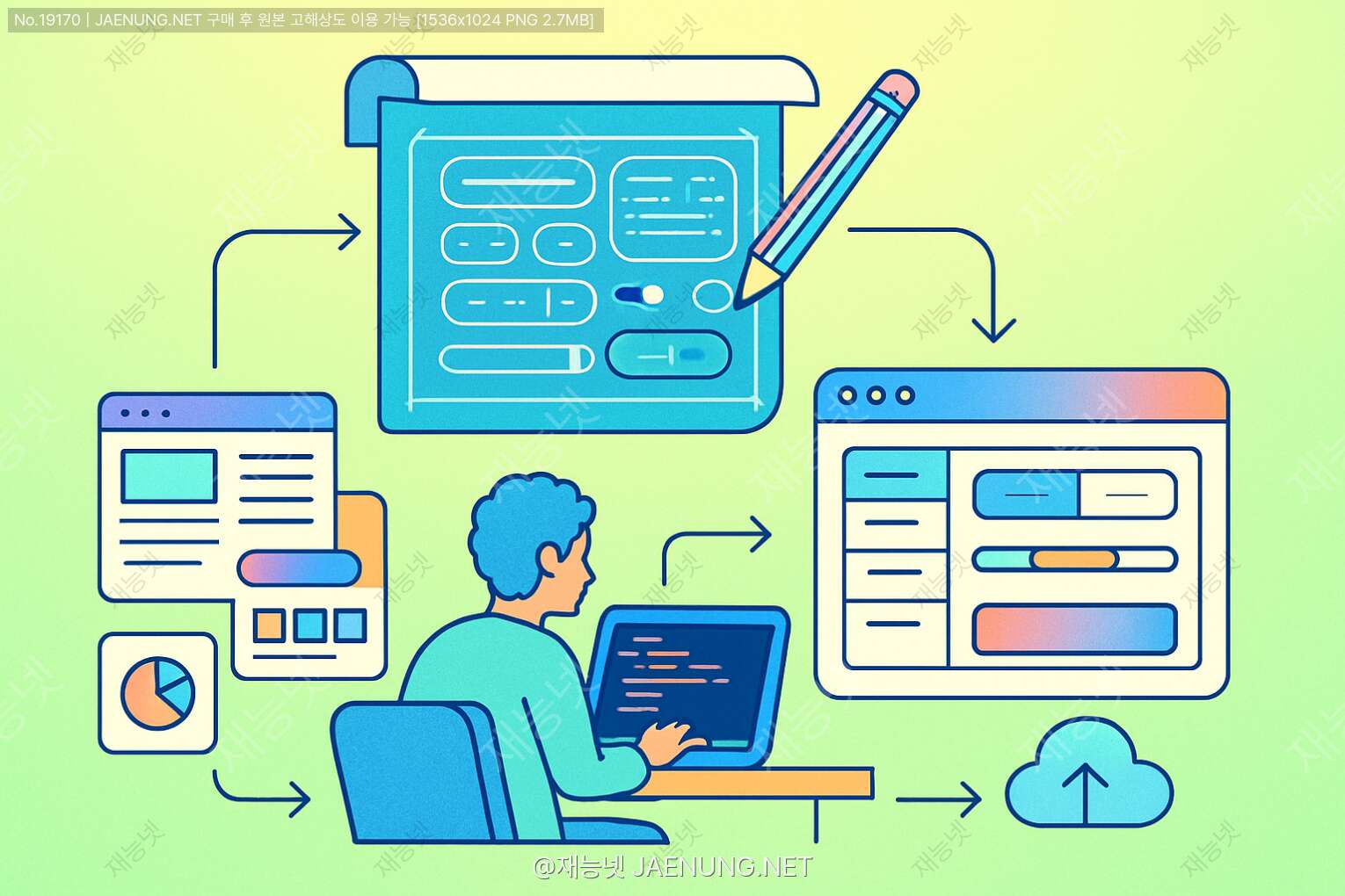
웹 컴포넌트 라이브러리 제작: 설계부터 배포까지
나만의 컴포넌트로 웹 개발 세계를 정복해보자! 🚀
안녕하세요, 웹 컴포넌트 세계로 오신 것을 환영합니다! 👋
요즘 프론트엔드 개발자라면 컴포넌트 기반 개발이 얼마나 중요한지 다들 아시죠? 컴포넌트는 현대 웹 개발의 핵심이라고 해도 과언이 아닐 정도로 중요해졌어요. 리액트, 뷰, 앵귤러 같은 프레임워크들이 모두 컴포넌트 기반으로 동작하는 것만 봐도 알 수 있죠! ㅋㅋㅋ
오늘은 여러분이 직접 웹 컴포넌트 라이브러리를 만들고 배포하는 방법에 대해 A부터 Z까지 알려드릴게요. 개발자로서 자신만의 라이브러리를 만들어 배포하는 경험은 정말 소중하거든요! 마치 재능넷에서 자신의 재능을 공유하는 것처럼, 여러분의 코딩 실력을 세상과 나눌 수 있는 기회랍니다. 😉
1. 웹 컴포넌트란 뭐길래? 🤔
웹 컴포넌트(Web Components)는 재사용 가능한 사용자 정의 HTML 요소를 만들 수 있게 해주는 웹 플랫폼 API의 모음이에요. 쉽게 말하면, 자신만의 HTML 태그를 만들 수 있다는 거죠! 예를 들어, <my-button>이나 <fancy-card> 같은 태그를 직접 만들어서 사용할 수 있어요.
웹 컴포넌트는 크게 세 가지 핵심 기술로 구성돼요:
- Custom Elements: 새로운 HTML 태그를 정의할 수 있게 해주는 JavaScript API
- Shadow DOM: 컴포넌트의 스타일과 마크업을 캡슐화하여 메인 문서와 분리
- HTML Templates:
<template>태그를 사용해 렌더링되지 않는 HTML 조각을 정의
이런 기술들을 활용하면 프레임워크에 종속되지 않는 진정한 의미의 재사용 가능한 컴포넌트를 만들 수 있어요. 리액트나 뷰 같은 프레임워크를 사용하지 않더라도, 순수 자바스크립트만으로 컴포넌트를 만들 수 있다니 진짜 미쳤다고 생각하지 않나요? ㄹㅇ 개발자 세계의 혁명이죠! 🔥
2. 왜 내 컴포넌트 라이브러리를 만들어야 할까? 🧐
아니 근데, 이미 수많은 컴포넌트 라이브러리가 있는데 굳이 또 만들어야 해? 라고 생각할 수도 있어요. 하지만 자신만의 라이브러리를 만드는 것에는 여러 장점이 있답니다:
🌟 커스터마이징의 자유
기존 라이브러리는 항상 100% 내 마음에 딱 맞지 않죠. 내가 직접 만들면 원하는 대로 완벽하게 커스터마이징 할 수 있어요. 디자인부터 기능까지 모든 걸 내 맘대로!
🚀 성능 최적화
필요한 기능만 넣어서 불필요한 코드를 줄이고 성능을 최적화할 수 있어요. 거대한 라이브러리를 가져다 쓰면 사용하지 않는 코드도 함께 불러오게 되잖아요? 그건 진짜 낭비죠!
💼 포트폴리오 강화
자신만의 라이브러리를 만들고 배포하는 경험은 개발자로서의 포트폴리오를 한층 업그레이드시켜줘요. 재능넷 같은 플랫폼에서 자신의 재능을 어필할 때도 큰 플러스 요소가 될 수 있죠! 😎
🧠 깊은 이해
컴포넌트 라이브러리를 직접 만들면서 웹 개발의 깊은 부분까지 이해할 수 있어요. 진짜 고수 개발자로 성장하는 지름길이랄까요?
3. 라이브러리 설계: 시작이 반이다! 📝
모든 훌륭한 프로젝트는 탄탄한 설계에서 시작해요. 컴포넌트 라이브러리도 마찬가지! 무작정 코딩부터 시작하면 나중에 엄청난 리팩토링 지옥에 빠질 수 있어요. ㅋㅋㅋ (경험담...)
3.1 목표 설정하기
먼저 라이브러리의 목표를 명확히 해야 해요:
- 어떤 문제를 해결하려고 하는지?
- 타겟 사용자는 누구인지?
- 어떤 종류의 컴포넌트를 포함할 것인지?
- 어떤 디자인 시스템을 따를 것인지?
명확한 목표 없이 시작하는 것은 목적지 없이 여행을 떠나는 것과 같아요. 길을 잃기 딱 좋죠! 😅
3.2 컴포넌트 계층 구조 설계
컴포넌트는 보통 다음과 같은 계층으로 나눌 수 있어요:
🔹 기본 컴포넌트 (Atoms)
버튼, 입력 필드, 아이콘 등 가장 기본적인 UI 요소들이에요. 더 이상 쪼개기 어려운 최소 단위의 컴포넌트죠.
🔹 복합 컴포넌트 (Molecules)
검색 폼(입력 필드 + 버튼), 카드 등 기본 컴포넌트들이 모여 만들어진 좀 더 복잡한 UI 요소들이에요.
🔹 섹션 컴포넌트 (Organisms)
헤더, 푸터, 사이드바 등 여러 복합 컴포넌트들이 모여 페이지의 한 섹션을 형성하는 컴포넌트들이에요.
이런 계층 구조를 따르면 재사용성과 유지보수성이 높아지고, 컴포넌트 간의 의존성도 명확해져요. 아토믹 디자인(Atomic Design) 방법론이라고 불리는 이 접근법은 정말 많은 개발자들이 애용하는 방식이에요!
4. 개발 환경 설정: 기초 공사가 중요해요! 🛠️
좋은 집을 짓기 위해서는 튼튼한 기초가 필요하듯, 좋은 라이브러리를 만들기 위해서는 탄탄한 개발 환경이 필요해요. 이제 본격적인 코딩을 시작하기 전에 개발 환경을 세팅해볼까요?
4.1 프로젝트 초기화
먼저 새 프로젝트를 만들고 npm을 초기화해요:
mkdir my-component-library
cd my-component-library
npm init -y
이렇게 하면 package.json 파일이 생성돼요. 이 파일은 프로젝트의 메타데이터와 의존성을 관리하는 중요한 파일이랍니다!
4.2 필요한 개발 도구 설치
웹 컴포넌트 라이브러리를 개발하기 위해 필요한 도구들을 설치해볼게요:
npm install --save-dev webpack webpack-cli webpack-dev-server
npm install --save-dev babel-loader @babel/core @babel/preset-env
npm install --save-dev html-webpack-plugin style-loader css-loader
npm install --save-dev jest @testing-library/dom
우와, 명령어가 좀 길죠? ㅋㅋㅋ 하지만 각각 중요한 역할을 해요:
- webpack: 모듈 번들러로, 여러 파일을 하나로 묶어주는 역할을 해요.
- babel: 최신 JavaScript 코드를 구형 브라우저에서도 동작하도록 변환해주는 트랜스파일러예요.
- html-webpack-plugin: HTML 파일을 자동으로 생성해주는 플러그인이에요.
- style-loader, css-loader: CSS 파일을 처리하는 로더들이에요.
- jest, testing-library: 테스트를 위한 도구들이에요.
4.3 Webpack 설정하기
프로젝트 루트에 webpack.config.js 파일을 만들어 다음과 같이 설정해요:
const path = require('path');
const HtmlWebpackPlugin = require('html-webpack-plugin');

module.exports = {
  entry: './src/index.js',
  output: {
    path: path.resolve(__dirname, 'dist'),
    filename: 'bundle.js',
    library: 'MyComponentLibrary',
    libraryTarget: 'umd',
  },
  module: {
    rules: [
      {
        test: /\.js$/,
        exclude: /node_modules/,
        use: {
          loader: 'babel-loader',
          options: {
            presets: ['@babel/preset-env']
          }
        }
      },
      {
        test: /\.css$/,
        use: ['style-loader', 'css-loader']
      }
    ]
  },
  plugins: [
    new HtmlWebpackPlugin({
      template: './src/index.html'
    })
  ],
  devServer: {
    static: {
      directory: path.join(__dirname, 'dist'),
    },
    compress: true,
    port: 9000
  }
};
이 설정은 소스 코드를 번들링하고, CSS를 처리하며, 개발 서버를 설정하는 역할을 해요. 웹팩 설정이 처음에는 좀 복잡해 보일 수 있지만, 익숙해지면 정말 강력한 도구랍니다! 👍
4.4 프로젝트 구조 만들기
이제 프로젝트 구조를 만들어볼게요:
my-component-library/
  ├── src/
  │   ├── components/
  │   │   ├── button/
  │   │   │   ├── button.js
  │   │   │   ├── button.css
  │   │   │   └── button.test.js
  │   │   ├── card/
  │   │   │   ├── card.js
  │   │   │   ├── card.css
  │   │   │   └── card.test.js
  │   │   └── ...
  │   ├── index.js
  │   └── index.html
  ├── dist/
  ├── package.json
  ├── webpack.config.js
  ├── babel.config.js
  ├── jest.config.js
  └── README.md
이런 구조로 만들면 각 컴포넌트가 독립적으로 관리되어 유지보수하기 편해져요. 컴포넌트별로 JS, CSS, 테스트 파일을 함께 두는 것도 좋은 방법이죠!
5. 첫 번째 컴포넌트 만들기: 버튼부터 시작해볼까요? 🔘
이제 실제로 첫 번째 웹 컴포넌트를 만들어볼게요! 가장 기본적인 UI 요소인 버튼부터 시작해볼까요?
5.1 Custom Element 정의하기
src/components/button/button.js 파일을 만들고 다음 코드를 작성해요:
// button.js
class MyButton extends HTMLElement {
  constructor() {
    super();
    this.attachShadow({ mode: 'open' });
    this._variant = 'primary';
    this._size = 'medium';
  }

  static get observedAttributes() {
    return ['variant', 'size', 'disabled'];
  }

  attributeChangedCallback(name, oldValue, newValue) {
    if (oldValue === newValue) return;

    if (name === 'variant') {
      this._variant = newValue || 'primary';
    } else if (name === 'size') {
      this._size = newValue || 'medium';
    } else if (name === 'disabled') {
      this._disabled = newValue !== null;
    }

    this.render();
  }

  connectedCallback() {
    this.render();
  }

  render() {
    const buttonClass = `my-button ${this._variant} ${this._size}`;
    const disabled = this._disabled ? 'disabled' : '';

    this.shadowRoot.innerHTML = `
      <style>
        :host {
          display: inline-block;
        }
        .my-button {
          border: none;
          border-radius: 4px;
          padding: 0;
          cursor: pointer;
          font-family: inherit;
          transition: all 0.3s ease;
        }
        .my-button:hover {
          opacity: 0.9;
        }
        .my-button:focus {
          outline: none;
          box-shadow: 0 0 0 3px rgba(0, 123, 255, 0.3);
        }
        .primary {
          background-color: #007bff;
          color: white;
        }
        .secondary {
          background-color: #6c757d;
          color: white;
        }
        .success {
          background-color: #28a745;
          color: white;
        }
        .danger {
          background-color: #dc3545;
          color: white;
        }
        .small {
          padding: 6px 12px;
          font-size: 14px;
        }
        .medium {
          padding: 8px 16px;
          font-size: 16px;
        }
        .large {
          padding: 10px 20px;
          font-size: 18px;
        }
        [disabled] {
          opacity: 0.6;
          cursor: not-allowed;
        }
      </style>
      <button class="${buttonClass}" ${disabled}>
        <slot></slot>
      </button>
    `;

    // 이벤트 리스너 추가
    const button = this.shadowRoot.querySelector('button');
    button.addEventListener('click', (e) => {
      if (!this._disabled) {
        this.dispatchEvent(new CustomEvent('my-click', {
          bubbles: true,
          composed: true,
          detail: { originalEvent: e }
        }));
      }
    });
  }
}

customElements.define('my-button', MyButton);

export default MyButton;
우와, 코드가 좀 길죠? ㅋㅋㅋ 하지만 하나씩 살펴보면 그렇게 어렵지 않아요! 웹 컴포넌트의 핵심 개념들이 모두 들어있는 코드랍니다:
- Custom Element:
HTMLElement를 확장해 새로운 HTML 요소를 정의했어요. - Shadow DOM:
attachShadow()로 캡슐화된 DOM을 생성했어요. - Attributes:
observedAttributes와attributeChangedCallback으로 속성 변화를 감지해요. - Slots:
<slot>태그로 컴포넌트 내부에 콘텐츠를 삽입할 수 있게 했어요. - Events: 커스텀 이벤트를 발생시켜 외부와 통신할 수 있게 했어요.
5.2 컴포넌트 사용하기
src/index.html 파일을 만들고 다음과 같이 작성해요:
<!DOCTYPE html>
<html lang="en">
<head>
  <meta charset="UTF-8">
  <meta name="viewport" content="width=device-width, initial-scale=1.0">
  <title>My Component Library</title>
</head>
<body>
  <h1>My Component Library Demo</h1>

  <section>
    <h2>Buttons</h2>
    <my-button>Default Button</my-button>
    <my-button variant="primary">Primary Button</my-button>
    <my-button variant="secondary">Secondary Button</my-button>
    <my-button variant="success">Success Button</my-button>
    <my-button variant="danger">Danger Button</my-button>
    <my-button size="small">Small Button</my-button>
    <my-button size="large">Large Button</my-button>
    <my-button disabled>Disabled Button</my-button>
  </section>
</body>
</html>
이제 src/index.js 파일을 만들고 버튼 컴포넌트를 가져와 등록해요:
// index.js
import './components/button/button.js';

// 나중에 다른 컴포넌트들도 여기에 추가할 수 있어요
// import './components/card/card.js';
// import './components/modal/modal.js';

console.log('My Component Library loaded!');
이제 개발 서버를 실행해볼까요?
npx webpack serve브라우저에서 http://localhost:9000에 접속하면 우리가 만든 버튼 컴포넌트들이 보일 거예요! 짜잔~ 첫 번째 웹 컴포넌트 완성! 🎉
6. 컴포넌트 확장하기: 더 많은 컴포넌트를 추가해볼까요? 🧩
버튼 컴포넌트를 성공적으로 만들었으니, 이제 다른 컴포넌트들도 추가해볼까요? 라이브러리를 풍성하게 만들어봐요!
6.1 카드 컴포넌트 만들기
src/components/card/card.js 파일을 만들고 다음 코드를 작성해요:
// card.js
class MyCard extends HTMLElement {
  constructor() {
    super();
    this.attachShadow({ mode: 'open' });
  }

  static get observedAttributes() {
    return ['title', 'image'];
  }

  attributeChangedCallback(name, oldValue, newValue) {
    if (oldValue === newValue) return;
    this.render();
  }

  connectedCallback() {
    this.render();
  }

  render() {
    const title = this.getAttribute('title') || '';
    const image = this.getAttribute('image') || '';

    this.shadowRoot.innerHTML = `
      <style>
        :host {
          display: block;
        }
        .card {
          border-radius: 8px;
          overflow: hidden;
          box-shadow: 0 4px 8px rgba(0,0,0,0.1);
          background-color: white;
          transition: transform 0.3s ease, box-shadow 0.3s ease;
        }
        .card:hover {
          transform: translateY(-5px);
          box-shadow: 0 8px 16px rgba(0,0,0,0.2);
        }
        .card-image {
          width: 100%;
          height: 200px;
          object-fit: cover;
          display: ${image ? 'block' : 'none'};
        }
        .card-content {
          padding: 16px;
        }
        .card-title {
          margin: 0 0 8px 0;
          font-size: 18px;
          font-weight: bold;
        }
        .card-body {
          color: #666;
        }
      </style>
      <div class="card">
        ${image ? `<img class="card-image" src="${image}" alt="${title}">` : ''}
        <div class="card-content">
          ${title ? `<h3 class="card-title">${title}</h3>` : ''}
          <div class="card-body">
            <slot></slot>
          </div>
        </div>
      </div>
    `;
  }
}

customElements.define('my-card', MyCard);

export default MyCard;
이제 src/index.js에 카드 컴포넌트를 추가해요:
// index.js
import './components/button/button.js';
import './components/card/card.js';

console.log('My Component Library loaded!');
그리고 src/index.html에 카드 컴포넌트 사용 예시를 추가해요:
<section>
  <h2>Cards</h2>
  <div style="display: grid; grid-template-columns: repeat(auto-fill, minmax(300px, 1fr)); gap: 20px;">
    <my-card title="Card Title 1" image="https://picsum.photos/300/200?random=1">
      This is a sample card with an image and some text content.
    </my-card>

    <my-card title="Card Title 2">
      This is a card without an image, just some text content.
    </my-card>

    <my-card image="https://picsum.photos/300/200?random=3">
      This card has an image but no title.
    </my-card>
  </div>
</section>
6.2 모달 컴포넌트 만들기
이번에는 좀 더 복잡한 모달 컴포넌트를 만들어볼게요:
// modal.js
class MyModal extends HTMLElement {
  constructor() {
    super();
    this.attachShadow({ mode: 'open' });
    this._isOpen = false;
  }

  static get observedAttributes() {
    return ['open'];
  }

  attributeChangedCallback(name, oldValue, newValue) {
    if (name === 'open') {
      this._isOpen = newValue !== null;
      this.render();
    }
  }

  connectedCallback() {
    this.render();
  }

  open() {
    this.setAttribute('open', '');
  }

  close() {
    this.removeAttribute('open');
  }

  render() {
    this.shadowRoot.innerHTML = `
      <style>
        :host {
          display: block;
        }
        .modal-backdrop {
          position: fixed;
          top: 0;
          left: 0;
          width: 100%;
          height: 100%;
          background-color: rgba(0, 0, 0, 0.5);
          display: ${this._isOpen ? 'flex' : 'none'};
          justify-content: center;
          align-items: center;
          z-index: 1000;
        }
        .modal {
          background-color: white;
          border-radius: 8px;
          max-width: 500px;
          width: 90%;
          max-height: 90vh;
          overflow-y: auto;
          box-shadow: 0 4px 20px rgba(0, 0, 0, 0.2);
          animation: modal-in 0.3s ease;
        }
        .modal-header {
          display: flex;
          justify-content: space-between;
          align-items: center;
          padding: 16px;
          border-bottom: 1px solid #eee;
        }
        .modal-title {
          margin: 0;
          font-size: 18px;
          font-weight: bold;
        }
        .close-button {
          background: none;
          border: none;
          font-size: 24px;
          cursor: pointer;
          color: #999;
        }
        .close-button:hover {
          color: #333;
        }
        .modal-body {
          padding: 16px;
        }
        .modal-footer {
          padding: 16px;
          border-top: 1px solid #eee;
          display: flex;
          justify-content: flex-end;
          gap: 8px;
        }
        @keyframes modal-in {
          from {
            opacity: 0;
            transform: translateY(-20px);
          }
          to {
            opacity: 1;
            transform: translateY(0);
          }
        }
      </style>
      <div class="modal-backdrop">
        <div class="modal">
          <div class="modal-header">
            <h3 class="modal-title"><slot name="title">Modal Title</slot></h3>
            <button class="close-button">×</button>
          </div>
          <div class="modal-body">
            <slot></slot>
          </div>
          <div class="modal-footer">
            <slot name="footer"></slot>
          </div>
        </div>
      </div>
    `;

    // 이벤트 리스너 추가
    const closeButton = this.shadowRoot.querySelector('.close-button');
    const backdrop = this.shadowRoot.querySelector('.modal-backdrop');

    closeButton.addEventListener('click', () => this.close());
    backdrop.addEventListener('click', (e) => {
      if (e.target === backdrop) this.close();
    });
  }
}

customElements.define('my-modal', MyModal);

export default MyModal;
이제 src/index.js에 모달 컴포넌트를 추가하고, src/index.html에 사용 예시를 추가해요:
<section>
  <h2>Modal</h2>
  <my-button id="openModalBtn">Open Modal</my-button>

  <my-modal id="myModal">
    <span slot="title">Welcome to My Modal</span>
    <p>This is a custom modal component built with Web Components!</p>
    <p>You can close it by clicking the X button, clicking outside the modal, or using the close button below.</p>
    <div slot="footer">
      <my-button variant="secondary" id="closeModalBtn">Close</my-button>
      <my-button variant="primary">Save Changes</my-button>
    </div>
  </my-modal>

  <script>
    document.addEventListener('DOMContentLoaded', () => {
      const modal = document.getElementById('myModal');
      const openBtn = document.getElementById('openModalBtn');
      const closeBtn = document.getElementById('closeModalBtn');

      openBtn.addEventListener('my-click', () => modal.open());
      closeBtn.addEventListener('my-click', () => modal.close());
    });
  </script>
</section>
이제 버튼, 카드, 모달까지 세 가지 컴포넌트를 가진 라이브러리가 완성됐어요! 이런 식으로 계속해서 다양한 컴포넌트를 추가할 수 있답니다. 😊
7. 테스트 작성하기: 품질을 보장해야죠! 🧪
좋은 라이브러리는 철저한 테스트가 뒷받침되어야 해요. 테스트 없는 코드는 마치 안전벨트 없이 운전하는 것과 같다고 할 수 있죠! ㅋㅋㅋ
7.1 Jest 설정하기
프로젝트 루트에 jest.config.js 파일을 만들어요:
// jest.config.js
module.exports = {
  testEnvironment: 'jsdom',
  setupFilesAfterEnv: ['./jest.setup.js'],
  moduleNameMapper: {
    '\\.(css|less|scss|sass)$': 'identity-obj-proxy'
  }
};
그리고 jest.setup.js 파일도 만들어요:
// jest.setup.js
// 웹 컴포넌트 API 폴리필
require('@webcomponents/webcomponentsjs/webcomponents-bundle.js');
필요한 패키지도 추가로 설치해요:
npm install --save-dev @webcomponents/webcomponentsjs identity-obj-proxy7.2 버튼 컴포넌트 테스트 작성하기
src/components/button/button.test.js 파일을 만들고 다음과 같이 작성해요:
// button.test.js
import './button.js';

describe('MyButton', () => {
  let button;

  beforeEach(() => {
    button = document.createElement('my-button');
    document.body.appendChild(button);
  });

  afterEach(() => {
    document.body.removeChild(button);
  });

  test('renders with default attributes', () => {
    expect(button.shadowRoot.querySelector('button')).not.toBeNull();
    expect(button.shadowRoot.querySelector('button').classList.contains('primary')).toBe(true);
    expect(button.shadowRoot.querySelector('button').classList.contains('medium')).toBe(true);
  });

  test('renders with custom variant', () => {
    button.setAttribute('variant', 'danger');
    expect(button.shadowRoot.querySelector('button').classList.contains('danger')).toBe(true);
  });

  test('renders with custom size', () => {
    button.setAttribute('size', 'large');
    expect(button.shadowRoot.querySelector('button').classList.contains('large')).toBe(true);
  });

  test('renders as disabled', () => {
    button.setAttribute('disabled', '');
    expect(button.shadowRoot.querySelector('button').hasAttribute('disabled')).toBe(true);
  });

  test('emits custom event on click', () => {
    const clickHandler = jest.fn();
    button.addEventListener('my-click', clickHandler);

    button.shadowRoot.querySelector('button').click();

    expect(clickHandler).toHaveBeenCalledTimes(1);
  });

  test('does not emit event when disabled', () => {
    button.setAttribute('disabled', '');

    const clickHandler = jest.fn();
    button.addEventListener('my-click', clickHandler);

    button.shadowRoot.querySelector('button').click();

    expect(clickHandler).not.toHaveBeenCalled();
  });
});
이런 식으로 각 컴포넌트마다 테스트를 작성하면 라이브러리의 품질을 보장할 수 있어요. 테스트를 실행하려면 package.json에 다음 스크립트를 추가해요:
"scripts": {
  "test": "jest",
  "test:watch": "jest --watch"
}
그리고 다음 명령어로 테스트를 실행해요:
npm test모든 테스트가 통과하면 초록색 체크 표시가 뜨고, 실패하면 빨간색 X가 뜨겠죠? 테스트가 실패하면 무엇이 잘못됐는지 알려주니 디버깅하기도 편해요! 👍
8. 문서화하기: 사용자를 위한 안내서 📚
아무리 좋은 라이브러리라도 문서화가 잘 되어 있지 않으면 사용하기 어려워요. 사용자들이 여러분의 라이브러리를 쉽게 이해하고 활용할 수 있도록 문서를 작성해봐요!
8.1 README.md 작성하기
프로젝트 루트에 README.md 파일을 만들고 다음과 같이 작성해요:
# My Component Library

A lightweight, framework-agnostic web component library built with vanilla JavaScript.

## Installation

```bash
npm install my-component-library
```

## Usage

### Import the library

```javascript
// Import the entire library
import 'my-component-library';

// Or import individual components
import 'my-component-library/dist/button';
import 'my-component-library/dist/card';
import 'my-component-library/dist/modal';
```

### Use the components

```html
<!-- Button Component -->
<my-button variant="primary" size="medium">Click Me</my-button>

<!-- Card Component -->
<my-card title="Card Title" image="path/to/image.jpg">
  Card content goes here
</my-card>

<!-- Modal Component -->
<my-modal id="myModal">
  <span slot="title">Modal Title</span>
  Modal content goes here
  <div slot="footer">
    <my-button variant="secondary" id="closeModalBtn">Close</my-button>
    <my-button variant="primary">Save</my-button>
  </div>
</my-modal>

<script>
  // Open modal
  document.getElementById('myModal').open();

  // Close modal
  document.getElementById('myModal').close();
</script>
```

## Available Components

### Button

| Attribute | Type | Default | Description |
|-----------|------|---------|-------------|
| variant | string | 'primary' | Button style variant ('primary', 'secondary', 'success', 'danger') |
| size | string | 'medium' | Button size ('small', 'medium', 'large') |
| disabled | boolean | false | Whether the button is disabled |

### Card

| Attribute | Type | Default | Description |
|-----------|------|---------|-------------|
| title | string | '' | Card title |
| image | string | '' | URL of the card image |

### Modal

| Attribute | Type | Default | Description |
|-----------|------|---------|-------------|
| open | boolean | false | Whether the modal is open |

## Events

### Button

- `my-click`: Fired when the button is clicked

### Modal

No custom events, but provides `open()` and `close()` methods.

## License

MIT
README는 라이브러리의 얼굴이라고 할 수 있어요. 설치 방법, 사용 예시, 컴포넌트 목록, API 문서 등을 포함하면 사용자들이 쉽게 시작할 수 있답니다!
8.2 문서 사이트 만들기
더 자세한 문서와 라이브 데모를 제공하기 위해 문서 사이트를 만드는 것도 좋은 방법이에요. Docsify나 Docusaurus 같은 도구를 사용하면 쉽게 문서 사이트를 만들 수 있어요.
예를 들어, Docsify를 사용한다면:
npm i docsify-cli -g
mkdir docs
docsify init ./docs
그리고 docs/index.html, docs/README.md 등을 수정해서 문서 사이트를 커스터마이징할 수 있어요. 각 컴포넌트별로 별도의 마크다운 파일을 만들어 자세한 사용법과 예시를 제공하는 것도 좋은 방법이죠!
문서 사이트에는 다음과 같은 내용을 포함하면 좋아요:
- 시작하기 가이드
- 각 컴포넌트별 상세 문서
- 라이브 데모
- API 레퍼런스
- 스타일 커스터마이징 가이드
- 자주 묻는 질문 (FAQ)
좋은 문서는 좋은 코드만큼이나 중요하다는 것을 기억하세요! 재능넷에서도 자신의 재능을 소개할 때 자세한 설명이 있으면 더 많은 관심을 받는 것과 같은 원리랍니다. 😉
9. 라이브러리 배포하기: 세상에 공개해볼까요? 🚀
드디어 라이브러리가 완성됐어요! 이제 세상에 공개할 차례예요. npm에 배포하면 누구나 여러분의 라이브러리를 사용할 수 있게 된답니다!
9.1 배포 준비하기
배포하기 전에 package.json 파일을 수정해서 필요한 정보를 추가해요:
{
  "name": "my-component-library",
  "version": "1.0.0",
  "description": "A lightweight, framework-agnostic web component library",
  "main": "dist/index.js",
  "module": "dist/index.esm.js",
  "files": [
    "dist"
  ],
  "scripts": {
    "build": "webpack --mode production",
    "test": "jest",
    "prepublishOnly": "npm run test && npm run build"
  },
  "keywords": [
    "web-components",
    "ui-library",
    "custom-elements",
    "javascript"
  ],
  "author": "Your Name",
  "license": "MIT",
  "repository": {
    "type": "git",
    "url": "https://github.com/yourusername/my-component-library.git"
  },
  "bugs": {
    "url": "https://github.com/yourusername/my-component-library/issues"
  },
  "homepage": "https://github.com/yourusername/my-component-library#readme",
  "dependencies": {},
  "devDependencies": {
    // ... 개발 의존성 패키지들
  }
}
이제 라이브러리를 빌드해요:
npm run build이 명령어를 실행하면 dist 폴더에 빌드된 파일들이 생성돼요.
9.2 npm에 배포하기
npm에 계정이 없다면 먼저 가입하고, 로그인해요:
npm adduser그리고 배포해요:
npm publish짜잔! 이제 여러분의 라이브러리가 npm에 공개됐어요! 🎉 누구나 npm install my-component-library 명령어로 설치할 수 있게 됐답니다.
9.3 GitHub Pages로 문서 사이트 배포하기
문서 사이트를 GitHub Pages로 배포하면 누구나 쉽게 접근할 수 있어요:
cd docs
git init
git add .
git commit -m "Initial docs site"
git remote add origin https://github.com/yourusername/my-component-library.git
git push -u origin master

# GitHub Pages 설정
git checkout -b gh-pages
git push origin gh-pages
GitHub 저장소 설정에서 GitHub Pages 소스를 gh-pages 브랜치로 설정하면
https://yourusername.github.io/my-component-library이제 여러분의 라이브러리가 세상에 공개됐어요! 다른 개발자들이 여러분의 작품을 사용하고, 피드백을 주고, 기여할 수 있게 됐답니다. 정말 뿌듯하지 않나요? 😊
10. 라이브러리 유지보수하기: 끝이 아닌 시작! 🔄
라이브러리를 배포했다고 끝이 아니에요. 좋은 라이브러리는 지속적인 유지보수와 개선이 필요하답니다!
10.1 버전 관리
라이브러리를 업데이트할 때는 시맨틱 버저닝(Semantic Versioning)을 따르는 것이 좋아요:
- MAJOR 버전: 이전 버전과 호환되지 않는 변경사항
- MINOR 버전: 이전 버전과 호환되는 새로운 기능 추가
- PATCH 버전: 이전 버전과 호환되는 버그 수정
예를 들어, 버그를 수정했다면:
npm version patch
npm publish
새로운 기능을 추가했다면:
npm version minor
npm publish
호환되지 않는 변경사항이 있다면:
npm version major
npm publish
10.2 이슈 및 PR 관리
GitHub에서 이슈와 풀 리퀘스트를 관리하는 것도 중요해요:
- 이슈 템플릿을 만들어 사용자들이 버그 리포트나 기능 요청을 쉽게 할 수 있게 해요.
- 풀 리퀘스트 템플릿을 만들어 기여자들이 필요한 정보를 제공할 수 있게 해요.
- 이슈와 PR에 라벨을 붙여 분류하고 우선순위를 정해요.
- 정기적으로 이슈와 PR을 검토하고 응답해요.
10.3 커뮤니티 구축
라이브러리 주변에 커뮤니티를 구축하는 것도 중요해요:
- 기여 가이드라인을 작성해 다른 개발자들이 참여할 수 있게 해요.
- 코드 오브 컨덕트(Code of Conduct)를 만들어 건강한 커뮤니티 문화를 조성해요.
- Discord나 Slack 채널을 만들어 사용자들과 소통해요.
- 정기적으로 블로그 포스트를 작성해 라이브러리의 발전 과정을 공유해요.
오픈 소스 라이브러리는 코드 그 자체보다 그 주변의 커뮤니티가 더 중요할 때가 많아요. 재능넷에서도 단순히 재능을 판매하는 것보다 고객과의 소통과 피드백이 중요한 것처럼요! 😊
마무리: 여러분도 할 수 있어요! 💪
지금까지 웹 컴포넌트 라이브러리를 설계부터 배포까지 전 과정을 살펴봤어요. 처음에는 어려워 보일 수 있지만, 하나씩 차근차근 따라하다 보면 여러분도 충분히 만들 수 있어요!
웹 컴포넌트 라이브러리를 만드는 과정은 단순히 코드를 작성하는 것 이상의 의미가 있어요. 설계, 개발, 테스트, 문서화, 배포, 유지보수까지 소프트웨어 개발의 전 과정을 경험할 수 있는 훌륭한 기회랍니다.
여러분이 만든 라이브러리가 다른 개발자들에게 도움이 되고, 오픈 소스 커뮤니티에 기여하는 경험은 정말 값진 경험이 될 거예요. 마치 재능넷에서 자신의 재능을 공유하며 다른 사람들에게 도움을 주는 것처럼요! 😊
이 글이 여러분의 웹 컴포넌트 라이브러리 제작 여정에 도움이 됐으면 좋겠어요. 질문이나 피드백이 있으면 언제든지 댓글로 남겨주세요! 화이팅! 🚀

댓글 작성
이 글에 대한 여러분의 생각을 들려주세요
로그인이 필요합니다
댓글을 작성하려면 먼저 로그인해주세요.
댓글 0
지식인의 숲 - 지적 재산권 보호 고지
지적 재산권 보호 고지
- 저작권 및 소유권: 본 컨텐츠는 재능넷의 독점 AI 기술로 생성되었으며, 대한민국 저작권법 및 국제 저작권 협약에 의해 보호됩니다.
- AI 생성 컨텐츠의 법적 지위: 본 AI 생성 컨텐츠는 재능넷의 지적 창작물로 인정되며, 관련 법규에 따라 저작권 보호를 받습니다.
- 사용 제한: 재능넷의 명시적 서면 동의 없이 본 컨텐츠를 복제, 수정, 배포, 또는 상업적으로 활용하는 행위는 엄격히 금지됩니다.
- 데이터 수집 금지: 본 컨텐츠에 대한 무단 스크래핑, 크롤링, 및 자동화된 데이터 수집은 법적 제재의 대상이 됩니다.
- AI 학습 제한: 재능넷의 AI 생성 컨텐츠를 타 AI 모델 학습에 무단 사용하는 행위는 금지되며, 이는 지적 재산권 침해로 간주됩니다.





아직 댓글이 없습니다.